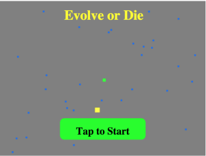
Finished game #3, yeah!
There is something uniquely satisfying about finishing something that you started and putting it out for the world to access and use.
I had heaps of fun making this game and learned a ton.
Lessons from game #3
Sometimes you have to cut features
I have started following this process when designing my games but I always add some nice to have features to my design in the (at this point unlikely) event that I finish the game early and can add some pizaz.
A couple of guidelines that I put on myself for this 1 game a month challenge was to try to make each of the games touch friendly and have some multiplayer component.
So far so good for the touch friendly part, but for this game, the multiplayer had to be cut to meet the deadline.
It has probably been done before
To be honest, I wasted a couple days trying to figure the camera thing out by myself without looking up anything on the internet about how it had been done before.
This was a terrible idea.
Most features in games have been done multiple times before and there is a lot of good information about the patterns and pitfalls involved in them. Use these resources to save time and headaches.
You can cheat a little at art
Although I really like to sketch on paper, I haven’t really found a way to draw on a computer that I actually want to sit down and do.
This was one of my hangups for the last year or so with making games, and why I waited till the last day to make the login and instruction pages. Not to mention, I haven’t spent enough time with Monkey-X’s fonts and such and the default one for drawing text to the screen is not really pretty.
But I head faked myself into creating it in a way that I was more comfortable figuring out.
By day I am a web programmer. So I simply took the tools that I already know for making a screen look good (html, css) and applied them to this problem.
Using a screen shot from the game and a little css magic, I made a webpage that looked like a little home screen for the game (complete with start button) and then took a screen shot of it.
Then to make the button work, I drew a rectangle to the screen and over played it on the button to figure out the dimensions and set up a touch/click listening event for that area.
Voila, cheating at art!
To Sum up
- Get to the MVP (Minimum Viable Product) first, then add other features.
- When you are stuck, don’t bang your head against the wall. Get help.
- Use your existing skills to find away around tough or annoying parts of the process (or see if you can get someone else to do them)
Game #3 — Evolve or Die
(itch.io seems to be down right now, will update post with link to game as soon as possible)

